
(Dutch, English below!)
Japonisme
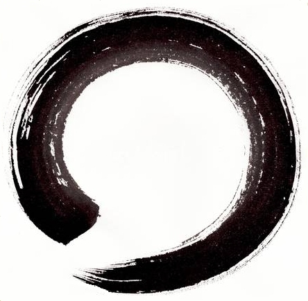
Als je met een in zwarte inkt gedoopte kwast een vrij grote cirkel tekent, in een doorgaande beweging, zoals Japanse monniken dat doen, dan heb je een ENSO (Cirkel) gemaakt (Zie voorbeeld hierboven). Het idee is om die cirkel niet te maken terwijl je denkt: nu ga ik een cirkel maken, je concentrerend op de kwast, de inkt en de perfectie van de beweging. De bedoeling is om die cirkel te maken terwijl je jezelf vergeet. Je laat je lichaam die cirkel tekenen, met een ander deel van je hersenen dan de hersenschors waar je gedachten in huizen. Je haalt adem en in de uitademing komt de beweging, vloeiend, resoluut, zo perfect mogelijk. In het moment. Maar dan. Het resultaat is niet perfect, want het toeval speelt aan alle kanten een rol. Er valt een druppel inkt. Haren van de kwast leiden een eigen leven, de hoeveelheid inkt is te weinig, het papier is te bobbelig. En zo is elke cirkel anders, sommige zijn saai en nietszeggend, andere weer verbazingwekkend interessant. Daar heeft het toeval een handje geholpen. De oude Grieken zeiden het al, het toeval bemint de kunst, de kunst bemint het toeval. De Japanners zitten daarbij in de buurt met wat zij noemen ‘Wabi Sabi’*. Ofwel de kracht van imperfectie en onvolmaaktheid. Het Enso’s maken wordt wel een spirituele manier van tekenen genoemd. Maar eigenlijk is niet het tekenen zelf spiritueel, maar de interpretatie van wat er is ontstaan. Schoonheid, als het is gelukt en teleurstelling als het niets bijzonders geworden is. Dat roept vragen op als: Waarom is daar schoonheid ontstaan en waarom is dat zo moeilijk te verwoorden? Wat is eigenlijk schoonheid? Het lijkt een soort van ‘devine quality’ die diep van binnen in ons voelbaar is. Is die gevoeligheid aangeleerd? En hoe kan schoonheid zomaar uit niets ontstaan? Hoe dan ook is het herkennen van schoonheid het herkennen van …. k w a l i t e i t.
Kwaliteit
De Amerikaan Robert Persig heeft een heel boek gewijd aan de definitie van kwaliteit. Het was voor mij in mijn studententijd een belangrijke eyeopener. Een filosofisch boek dat leest als een road movie. Het boek heet ‘Zen and the art of Motorcycle Maintenance’. Uiteindelijk definieert hij daarin kwaliteit als het begin, als de basis van alles. Sommige dingen veranderen je leven, dat boek en de ontdekking van het Japonisme en het ontdekken van het Enso maken deden dat voor mij. Het Japonisme is een vrij onbekende periode geweest in de Europese kunstgeschiedenis. Het zette begin vorige eeuw Europa op zijn kop met nieuwe, van Japan geleerde esthetische regels (‘memes’) voor ontwerpers, kunstenaars en architecten. Zoals ‘Kanso’, de kunst van het weglaten en het lastig te definieren ‘Wabi Sabi’. Uiteindelijk vormden deze ontdekkingen ook de basis van mijn huidige schilder-inspiratie . Ik wilde zelf niet als een monnik Ensos gaan maken. Na een aantal keren had ik dat wel gezien. Ik was en ben niet erg geinteresseerd in de Zen Boeddistische kant van de zaak. Wel in de esthetische kant van het verhaal. Ik wilde kijken of ik het op een ander nivo kon tillen, vrij van de simpele maar aanwezige dogmatiek die eraan kleeft, verder explorerend en zoekend naar nieuwe wegen. Het gaat om het onderzoeken van minimalisme, vooral ook van de kracht van Wabi Sabi. En natuurlijk ook het onderzoek van contrasten in vorm en kleur.
Eigen ontwikkeling
Ten eerste wilde ik heel groot gaan werken. Eendrachtig de stelling (Walter Grophius?) dat een vierkante meter blauw blauwer is dan een vierkante centimeter blauw. En ja, ik wilde voorbij het zwart witte gaan kijken wat er met kleur mogelijk was. Dus het moesten studies worden naar Wabi Sabi, Less is more en kleurcontrast. Alles tegelijk. Maar dan ontstaat er meteen een probleem: Hoe ga je heel groot Enso-achtige schilderijen maken? Met een supergrote kwast? Ik besloot het praktisch te houden. Ik maak studies in het klein en gebruik daar alle mogelijke middelen voor, potlood, viltstift, pen, computer, alles mag, alles is een instrument zolang ik het zelf hanteer. Vanuit mijn ervaring als ontwerper van producten weet ik dat consequent in vormtaal zijn belangrijk is, alle kanten van een product moeten dezelfde vormtaal spreken, zo ook zou dat moeten gelden voor de grafische vormtaal in mijn studies. Het voordeel van de computer is dan groot: Je kunt zoveel studies maken als je wilt, het kost vrijwel niets. Maar ik wilde wel een serie maken die duidelijk dezelfde uitgangspunten en vormtaal hanteert. Zo ben ik begonnen met het maken van mijn eerste grote doek.
Opleiding
Ik ben opgeleid als Industrial Designer. Gestart ben ik met de studie aan de TU Delft, afgemaakt heb ik de studie aan de Gerrit Rietveld Academie te Amsterdam.
Professionele carriere
Naast mijn eigen ontwerppraktijk heb ik in het onderwijs gewerkt, voornamelijk aan de Technische Universiteit Delft, Faculteit van het Industrieel Ontwerpen, als docent / hoofddocent en in mindere mate als onderzoeker. Mijn specialisme: “Design aesthetics”
*
Van Wikipedia, de gratis encyclopedie:
In de traditionele Japanse esthetiek is wabi-sabi een wereldbeeld waarop de aandacht gericht is
op de acceptatie van vergankelijkheid en imperfectie. De esthetiek is soms
beschreven als een van schoonheid die “onvolmaakt, vergankelijk, en
incompleet” is. Kenmerken van wabi-sabi omvatten asymmetrie,
ruwheid, eenvoud, economie, soberheid, bescheidenheid, intimiteit en
waardering voor de ingenieuze integriteit van natuurlijke objecten en processen.
Ger Bruens
designer / auteur / kunstschilder
ENGLISH
Japonism
If you draw a rather large circle with a brush dipped in black ink, in a continuous movement, as Japanese monks do, then you have created an ENSO (Circle) (see the example on top of the page). The idea is not to make that circle while you think: now I’m going to make a circle, concentrating on the brush, the ink and the perfection of the movement. The intention is to make that circle while you forget yourself. You let your body draw that circle, with a different part of your brain than the cerebral cortex that houses your thoughts. You take a breath and in the exhale the movement comes, fluently, resolutely, as perfectly as possible. In the moment. But then. The result is not perfect, because coincidence plays a role on all sides. There is a drop of ink. Hair of the brush lead a life of its own, the amount of ink is too little, the paper is too lumpy. And so every circle is different, some are boring and meaningless, others are amazingly interesting. That is where coincidence helped. The ancient Greeks already said it, fortuity loves art, art loves fortuity. The Japanese say more or less the same with what they call ‘Wabi Sabi’ *. The power of imperfection and incompleteness. Making Ensos is called a spiritual way of drawing. But actually not the actual drawing activity is spiritual, but the interpretation of what has been created. Beauty, if it is successful and disappointment if it has become nothing special. This raises questions such as: Why did beauty arise there, and why is that so difficult to articulate? What is actually beauty? It seems to be a sort of ‘devine quality’ that can be felt deep within us. Has that sensitivity been learned? And how can beauty just come from nothing? Anyway, recognizing beauty is recognizing …. q u a l i t y.
Quality
The American author Robert Persig has devoted a whole book to the definition of quality. It was an important eye-opener for me during my student days. A philosophical book that reads like a road movie. The book is called ‘Zen and the art of Motorcycle Maintenance’. Ultimately, he defines quality as the beginning, as the basis of everything.
Some things change your life, that book and the discovery of Japonism and the discovery of the Enso did that for me. Japonism has been a fairly unknown period in European art history. It turned Europe upside down at the beginning of last century with new aesthetic rules (‘memes’) from Japan for designers, artists and architects. Like ‘Kanso’, the art of omission and the hard to define ‘Wabi Sabi’. Eventually these discoveries also formed the basis of my current inspiration. I did not want to make Ensos myself as a monk. After a number of times I was done with it. And I was and am not really interested in the Zen Buddhist side of the matter. I am interested in the aesthetic side of the story. I wanted to see if I could lift it to a different level, free of the simple but present dogmatics that stick to it, exploring further and looking for new ways. It is about researching minimalism, especially about the power of Wabi Sabi. And of course the research of contrasts in form and color.
Own development
First, I wanted to work very big. Following the (Walter Grophius?) statement that a square meter of blue is blueer than a square centimeter of blue. And yes, I wanted to see beyond the black and white what could be done with color. So I started making Wabi Sabi, Less is more and color contrast studies. Everything at once. But then there is immediately a problem: How do you make very large Enso-like paintings? With a super-large brush? I decided to keep it practical. I make studies in miniature and use all possible means, pencil, felt pen, pen, computer, everything is allowed, everything is an instrument as long as I use it myself. From my experience as a designer of products, I know that being consequent in design language is important, all sides of a product have to speak the same form language, and that should also apply to the graphic design language in my studies. The advantage of the computer is then great: You can make as many studies as you want, it costs almost nothing. But I did want to make a series that clearly uses the same basic principles and form language. That is how I started making my first big canvas.
Education
I trained as an Industrial Designer. I started with the study at Delft University of Technlogy, I completed my education at the Gerrit Rietveld Academy in Amsterdam.
Professional carier
In addition to my own design practice, I have worked in education, mainly at Delft University of Technology, Faculty of Industrial Design, as a teacher / associate professor and to a lesser extent as a researcher. My specialization: “Design aesthetics”.
*
From Wikipedia, the free encyclopedia:
In traditional Japanese aesthetics, wabi-sabi is a world view centered on
the acceptance of transience and imperfection. The aesthetic is sometimes
described as one of beauty that is “imperfect, impermanent, and
incomplete”. Characteristics of the wabi-sabi aesthetic include asymmetry,
roughness, simplicity, economy, austerity, modesty, intimacy, and
appreciation of the ingenuous integrity of natural objects and processes.
Ger Bruens
designer / author / visual artist